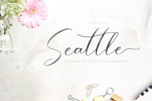
Seattle: A Modern Script Font That Fits Real Creative Workflows
Seattle isn’t just another script font—it’s a deliberate design tool built for people who balance aesthetics with intention. Designed with graceful swashes, consistent rhythm, and subtle contrast, Seattle supports clarity without sacrificing personality. Whether you’re refining a brand identity, preparing course materials, launching a small business website, or designing social assets for a client project, Seattle works where legibility meets expression.
Where Seattle Fits in Your Creative Process
Fonts aren’t isolated assets—they’re part of a sequence. You don’t pick Seattle *after* finalizing layout; you consider it early, alongside tone, audience, and medium. For example, if you’re building a wellness brand’s visual language, Seattle’s friendly yet modern character helps establish warmth before writing a single headline. Its lowercase ‘g’, ‘y’, and ‘f’ include elegant swashes that reinforce continuity across touchpoints—logos, email headers, printed handouts—without requiring manual adjustments each time.
That makes Seattle especially useful during the refinement phase: after wireframing but before asset handoff, when typography choices begin shaping perception. It’s less about decoration and more about reinforcing voice at scale—especially when paired with clean sans-serifs like Inter or Lato for body text. This pairing creates hierarchy without visual competition, letting your message land clearly.
Using Seattle Before Launch: Planning and Preparation
Before importing Seattle into Figma, Adobe Creative Cloud, or Google Fonts (via self-hosting), take time to assess compatibility and usage scope. Seattle is a desktop-licensed font—meaning web use requires embedding via @font-face or converting subsets for performance. If you're a freelancer delivering brand guidelines, include clear instructions: “Use Seattle for headlines and short quotes only; avoid long paragraphs or small sizes (<16px) due to swash density.”
Preparation also means testing contrast. Seattle’s thin strokes and flowing terminals read well on light backgrounds but need careful handling on dark or textured surfaces. Run quick checks in real environments—preview an Instagram carousel slide, print a 5×7 postcard, test readability on mobile Safari—not just in design software. This step prevents rework later and builds consistency across formats.
During Execution: Integration Without Friction
Integrating Seattle smoothly starts with naming conventions and file organization. Save your .otf files with version numbers (e.g., Seattle-Regular-v2.1.otf) and keep a dedicated /fonts/ folder inside your project directory. In collaborative tools like Figma, create a shared text style named “Headline – Seattle Swash” with preset line height (1.3), tracking (+20), and swash-enabled OpenType features toggled on. That way, teammates apply the same treatment without hunting through menus.
For marketers and educators, Seattle shines in short-form communication: email subject lines, workshop banners, podcast cover art, or certificate headers. Its swashes add distinction without overwhelming—unlike overly ornate scripts that sacrifice scannability. One practical tip: activate swashes selectively. Use them on first letters of titles (“Seattle Workshop Series”) but default to standard glyphs in navigation menus or footer links. This balances impact with usability.
After Delivery: Consistency and Long-Term Use
A font’s value multiplies over time—not just in one project, but across iterations. Seattle holds up because its design avoids trend dependency. It doesn’t mimic handwriting or lean too far into retro or futuristic cues. That neutrality makes it reusable: the same font family can support a tech startup’s launch campaign this year and a local bakery’s holiday menu next season—without feeling mismatched.
To sustain quality control, document usage rules in a lightweight style guide—even if it’s just a Notion page or shared Google Doc. Note which swashes work best (e.g., initial ‘S’, terminal ‘e’), minimum size thresholds, and fallbacks for unsupported environments (e.g., “If Seattle fails to load, display as Merriweather Italic”). This protects your intent when systems change or team members rotate.
How Seattle Works With Other Tools and Decisions
Seattle doesn’t exist in isolation. Its effectiveness depends on how it interacts with your stack:
- Design tools: In Figma, enable OpenType features manually per text layer. In Illustrator, use the Glyphs panel to insert alternate swash characters. In Canva, upload Seattle as a custom font—then save templates with pre-styled text boxes to maintain consistency.
- Web platforms: Self-hosting gives full control but requires basic CSS knowledge. Avoid loading the full font file if only using swashes on H1s—subset the font to include only uppercase letters, numerals, and key swash glyphs. Tools like Font Squirrel’s Webfont Generator help streamline this.
- Collaboration: Share a ZIP containing the font + license + usage notes—not just the .otf. Include a README.txt explaining permissions (e.g., “Licensed for commercial use, includes desktop and web embedding rights”). This prevents licensing oversights during client handoff or team onboarding.
- Content strategy: Match Seattle’s expressive tone with concise, human-centered copy. Long sentences or jargon dilute its effect. Instead of “Leverage synergistic paradigms,” try “Grow with purpose”—shorter phrases let the font breathe and resonate.
Practical Implementation Tips for Different Roles
Freelancers and agencies: Bundle Seattle into your starter kit—alongside color palettes and grid systems—so every new client project begins with intentional typography. Charge a small line item for “custom font licensing and integration” to reflect the time spent testing, documenting, and optimizing.
Educators and course creators: Use Seattle for module titles and certificate headers—not slide body text. Its distinctiveness helps learners visually anchor to sections, improving information retention. Pair with a highly legible sans-serif (e.g., Open Sans) for captions and annotations.
Small business owners: Start simple. Apply Seattle to your logo lockup and one recurring asset—like weekly newsletter headers—and expand only after confirming it resonates with your audience. Track engagement metrics: do emails with Seattle-based subject lines see higher open rates? Does your Instagram bio link get more clicks when styled with Seattle? Let data—not assumptions—guide expansion.
Bloggers and content creators: Embed Seattle in your site’s CSS for pull quotes and featured post titles. Avoid applying it globally—reserve it for moments where emphasis matters. That restraint keeps your site feeling curated, not cluttered.
What Makes Seattle Sustainable Over Time
Long-term use comes down to discipline—not just selection. Seattle remains effective because it resists visual fatigue: its letterforms are distinctive but not exhausting to read at appropriate sizes and densities. Unlike fonts that rely on novelty alone, Seattle supports repeated exposure without diminishing returns.
Its flexibility also supports evolution. As your brand grows, Seattle adapts: tighten tracking for bold signage, loosen it for elegant invitations, pair swashes with geometric icons for modern contrast. No redesign needed—just thoughtful application.
Finally, Seattle encourages intentionality. Choosing it signals that you’ve considered not just how something looks, but how it functions across contexts, devices, and timelines. That mindset—grounded in process, aligned with goals, respectful of constraints—is what separates polished execution from surface-level styling.